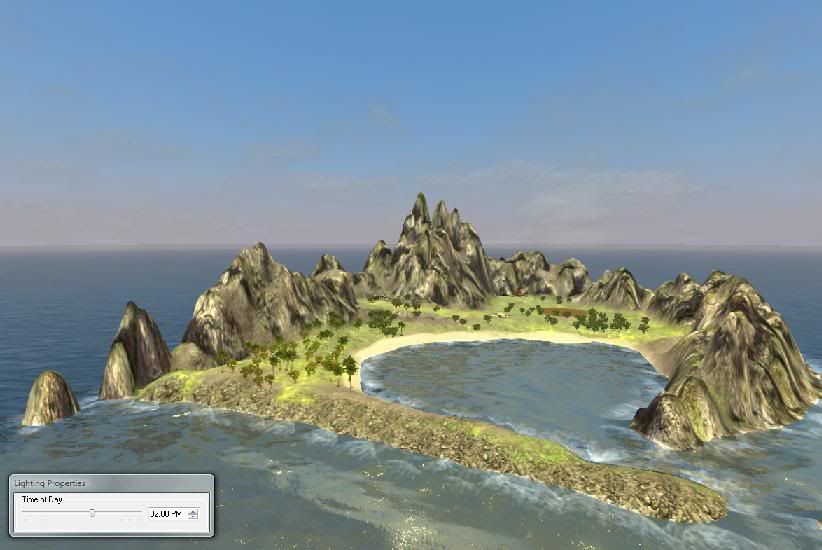
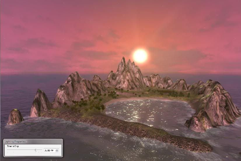
Sorry for taking oodles of time doing this - finally got round to it! Basically all this does is explain what each of the tools do in the lighting mode; when I've got a little more experience I'll try to put together a proper tutorial to go with this, but for now, I hope you'll be able to learn a little from reading this guide and having a look over some of the official maps

To enter lighting mode, go mode>>edit lighting
Also, you'll need the lighting properties tool: go view>>lighting properties
Why this little guide? Well lighting in the BW2 graphics engine can give some pretty cool effects, and add a little more realism to a landscape, as I hope these two images show:
I’ll start… at the top of the lighting editor toolbox...
Sky type: here we define the time of day that we are actually editing. For example, if you set the time of day to 2pm (in the lighting properties we opened earlier), you’ll find that if you click ‘add’ the editor automatically inserts a new lighting time-point into the map, for that specific time, or you can adjust the slider. If you give it a name instead then it is no longer attached to any time of day; if you click ‘OK’ then the new time point is inserted and you can now freely edit the lighting for that time of day. It’s important to always remember that the time you are editing and the time you are viewing are not tied, so you can set the time in ‘lighting properties’ differently, which can be confusing - if when you change something and nothing seems to happen, this is the likely culprit!
Now I’m going to swerve rather violently off topic somewhat and mention something that I find helps a lot, and I warn you it is rather stating the obvious, but nonetheless: computer graphics are nothing more than simulations that use extensive shortcuts to produce something that resembles reality. Computer graphics cannot deal in light intensities, only in colour. Look closely at the reflections on the waves in BW2 you’ll see they are simply white highlights, look at the shadows - they are merely a darker shade of whatever texture they are on top of. The apparent transition from day to night is nothing more than a blending change in the colours used to light a scene. I’ll come back to this.
The next point is at the bottom; ‘save’ and ‘load.’
These two buttons are somewhat misleading – a better choice would have been ‘import’ and ‘export’ since that is all they do. By saving a lighting setting you do not implant that setting into the landscape (this is done automatically when you add a new time point as outlined above) you merely export those settings into a .sky file, which may be used to import those exact settings into another time point that you might be editing, using ‘load.’ You can also load a .sky file in a script, to be loaded when some custom event happens, but this is beyond scope here.
Next, everything between (but not including) the top, and the three buttons labelled
‘Intensity’ ‘colour x’ and ‘colour y’ – leave everything at its default setting for now.
Sky colour: pretty self explanatory except for one minor point: the default is white, yet the sky will appear blue. Using the default colour, if you move the ‘exposure’ slider to 0, you’ll see the sky turns black, crank it to maximum and the sky is white. However, there is a little more to it than that; remember I mentioned lighting in a computer being just a blend of colours? Well the BW2 engine uses the sky colour as the background colour of the landscape too, so if you pick a really lurid shade of red, you’ll see the landscape looks pretty mingin’! The ‘exposure' slider doesn’t affect the landscape unless it is at absolute zero however.
As a general rule of thumb with lighting, pale or earthy colours work best, for example a pale shade of violet makes a decent sky colour. Set the ‘exposure’ a level you’re happy with and leave it at that. The ‘intensity’ slider at the top will shift the actual sky colour from invisible (appears as white) right up to an exact match of your chosen colour.
Sun colour: you’ll notice something odd about some of Lionheads maps- the sun colour is blue! Sun colour does not affect the colour of the sun you can see in the sky, but it is another background colour on the landscape, and also the colour of the highlights on the waves. It gives you a means of changing the landscape colour without affecting the sky, which can come in handy for things like sunsets, and unlike the sky colour, you can alter the strength and shade of the blending. For example, select a really lurid sun colour (lurid colours are best for seeing the effect of a given tool), set ‘sun exposure’ to zero and move the slider next to ‘sun colour’ and you should see your landscape being blended with the sun colour, the shade of which will change from white when the slider is zero, to your precise colour choice when it is at its maximum setting. Leaving it on maximum, go back to the ‘sun exposure’ slider and move it, you should see how this increases the strength of the sun colour blending on the landscape. Have a play with balancing the two sliders using a colour you are happy with (eg pale yellow – see the rule of thumb above), and remember that extremes tend not to work the best, it’s a balance!
Ambient colour: anything that the sun colour doesn’t touch on the landscape, the ambient colour will. The slider affects it’s shade from white (invisible) up to your colour of choice. Play with it and see!
Fill colour affects both the things that the sun colour touches and the slider functions in the same way as the ambient colour. This is used to put a blend over both the sun and ambient colours simultaneously, eg red fill colour shifts the sun colour and the ambient colour more towards red, while maintaining the difference between the two.
Turbidity: no idea, but it does do some weird things. I suspect this might even be a broken feature. Find a setting that isn’t broken (usually somewhere about 5) and leave it at that. If someone knows better, then please say
I’ve explained the sun and fill directional blending sliders in a post above this.
Horizon: the horizon actually has its own colour which, until you say otherwise, is based upon the sky colour. The ‘colour x’ and ‘colour y’ buttons switch between a red and a blue/green channel respectively (I’m not entirely certain on these points). You can adjust their strength using ‘hor intensity’ slider’ but it seems to bug out at about 3.8. Play around with them to see their effects, but for day-time settings I would leave them be, they come in handy for red sunsets, as their strength seems to be greatest with a low sun
As Kays requested, I’ve included some .sky files attached to this post. The 8pm one looks identical to the 2pm one, except that the x and y colours on the horizon gradient have been adjusted to make a sunset! The night time one isn’t quite as I’d like it yet, but it’s close.
When you get comfortable, and start adding more time points, you might want to keep in mind what I said at the start about how simulated lighting works. The changes in time of day in the game are reflected by blending from one light setting to the next, and so the more gradual the transition, the more subtle the effect, but be aware: the middle colour between two of your time points may be bright blue, causing your whole map to suddenly turn blue at some specific point! Also, the game engine has its own ideas about what lighting is good (actually, it just has a default value), and if you leave long periods in between your edited time-points, it seems to have a tendency to revert to those default settings until the time is in close proximity to one you did edit again.
There’s a couple of things I haven’t tested yet, in particular the alternative settings that seem to be built in for each time point, in the pull down menu towards the top there are options for good neutral and evil. When I tested some lighting in-game, I noticed that no matter my alignment the lighting remained the same. I suspect that adjusting the ‘good’ and ‘evil’ settings will trigger the game to use the respective lighting according to your alignment.
One final thing: I put those two showey-off pics at the top, to illustrate what lighting can do. However, there is one little extra thing I didn’t mention. The green colour of the grass is the natural colour of that texture- there are absolutely no extra colours applied to any of the textures whatsoever in that landscape, it’s all done with lighting.

Edit:: For long periods between time points, I usually export a setting, and then use it to insert a duplicate setting between the two time points to keep the engine from reverting to it's defaults in the meantime
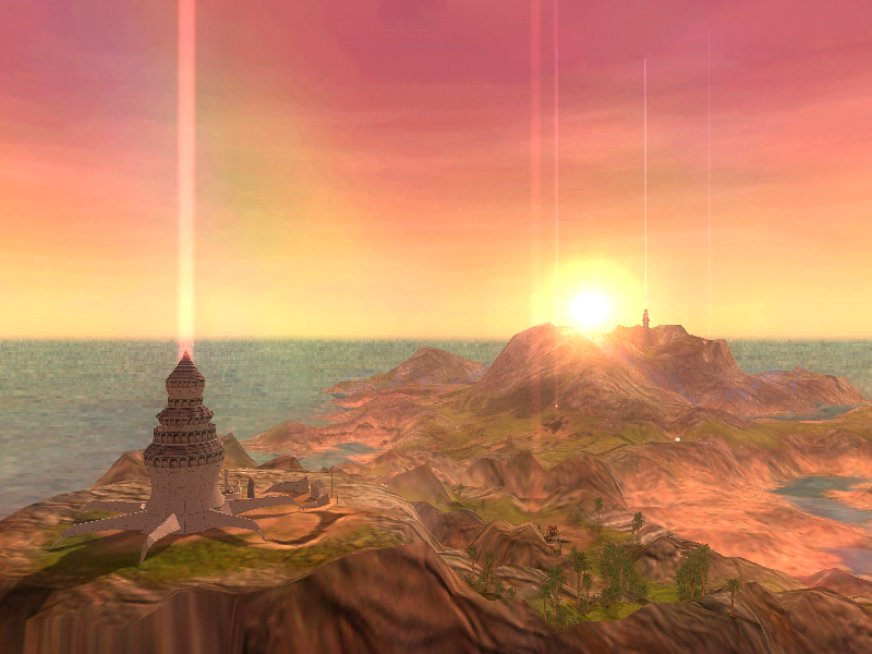



 ). Each of the globes starts out in the centre of their adjustments planes until you modify their positions. So far as I can tell, there is no way to return them to the centre once you change their positions